Cool Dashboards - No, Seriously
Visual analysis tools based on your requirements, not ours.
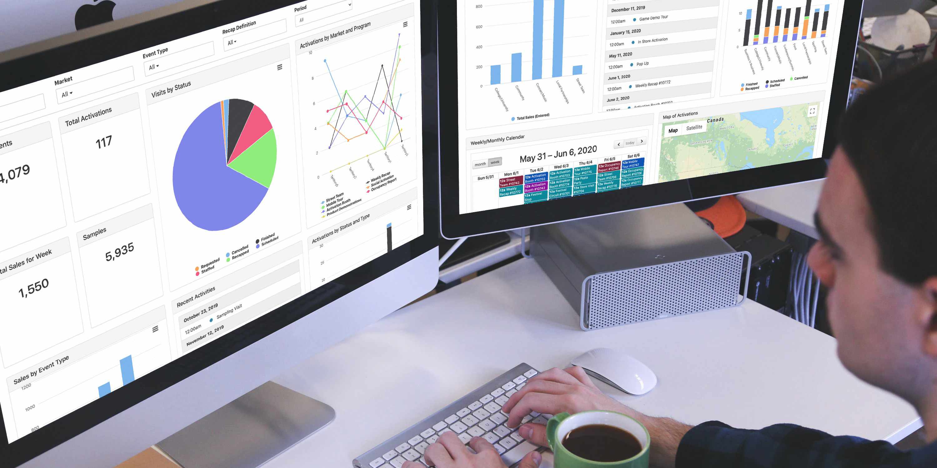
The MainEvent users have spoken, and they want great Dashboards.
“We need a Dashboard - not a fluffy Dashboard that just looks nice and shows garbage data. I want to look at this page and know exactly where we are and what we are doing with all of our activations for all programs and departments.”
Sure, but that’s a little ambiguous. Can you be more specific?
“We need a variety of stats, charts, upcoming activities, and calculations based on the KPIs that our programs require.”
Done. What next?
“This Dashboard needs to be configured by our team EASILY. I want drag and drop functionality, and to control the size and colors of each graph.“
You got it. Please, continue.
“When objectives change, we need to be able to alter the Dashboard ourselves without your involvement.”
The power is in your hands. Anything else?
“We have a variety of data sources: recap responses from the field, product sales, integrations with data collection vendors, and surveys. Can we pull them all into Dashboards?”
Absolutely. The Dashboard Builder allows you to build, measure, and analyze all information stored in MainEvent. To see how it empowers you to deliver what you need, in the exact format required, on your own terms, play the demo video.
Your Dashboard, Your Data
If the data is in MainEvent, you can show it off on your Dashboard. Needs vary greatly from user to user, but here are some popular examples of what marketers are displaying on theirs.
- Recap responses from the field
- Product information
- Survey responses
- Account details
- Staff data (e.g, open/pending shifts)
- Budget information
- Allocations (e.g. scheduled/completed, remaining)
- Sales information (from integrations or based on recap responses)
- Asset details (for clients that require asset management and/or mobile tours)
- Event/Activation status (e.g. completed, scheduled, requested)
- Goal-based information
- Data collection details from 3rd party integrations
Visual Formats Galore
As they say in the Dashboard business - the world is your oyster. You can choose from a plethora of visualization options when building your Dashboard Widgets, including:
- Bar Chart
- Line Graph
- Stacked Bar Chart
- Pie Chart
- Stat Billboard
- Map
- Agenda
- Weekly/Monthly Calendar
- Photos / Videos from Activations
- Asset Calendar
- Routing Map
- Text Message update
For each widget, you decide what field(s) you need, by what frequency (day, week, month, year). Customize further via the kind of display, field types, and even the size of each widget.
The End Result
With revamped Dashboards, MainEvent users can now analyze and digest their most important data in an intuitive, easy-to-use manner. Gone are the days of wrangling third-party reporting platforms and spending hours manipulating data to make pretty PowerPoint presentations.
After all, you’re the expert - only you know the precise KPIs and objectives of your programs. Our job is to equip you with software to produce what you need in the way that you envision it. The Dashboard Builder, born directly from MainEvent user feedback, allows you to do just that.
Want to see the new Dashboard in action? Contact us to set up a demo.